Dark and Light Mode: A Simple Guide for Web Design and Development

Julia Undeutsch
Dark and light modes play a crucial role in web and app design. This article explores their features, benefits, accessibility considerations, implementation methods, integration with system settings, and testing strategies. It also discusses best practices for designing without a toggle switch, ensuring an optimal user experience for all.
What is Dark and Light Mode?
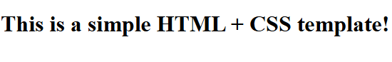
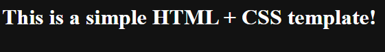
Dark and light mode are two distinct visual themes that adjust the color scheme of a website or application. Light mode typically features a white or light-colored background with dark text, while dark mode inverts this, using a dark background with light-colored text.
The goal of these modes is to provide users with a comfortable and customizable viewing experience based on their preferences or environmental conditions.
Why Do We Need It? (Accessibility Considerations)
The primary reason for offering dark and light mode is accessibility and usability. Some users prefer dark mode for reducing eye strain, especially in low-light environments, while others find light mode easier to read in bright conditions.
Additionally:
- Reduced Eye Strain: Dark mode can be easier on the eyes, especially at night.
- Improved Readability: Light mode provides higher contrast in well-lit environments.
- Energy Efficiency: OLED and AMOLED screens use less power in dark mode because fewer pixels are illuminated.
- Accessibility Needs: Users with visual impairments, light sensitivity, or conditions like photophobia may benefit from customizable themes.
How Do We Usually Implement It on a Website? (Toggle Switch)
The most common way to implement dark and light mode is through a toggle switch. This allows users to manually switch between the two modes. The typical process involves:
- Adding a toggle button: A simple switch in the UI.
- Using CSS Variables: Define color variables and switch them dynamically.
- Saving the preference: Store the user’s choice in
localStorageorcookies. - Applying the styles: Use JavaScript to apply the preferred mode.
Example CSS approach:
:root {
  --background-color: white;
  --text-color: black;
}

[data-theme='dark'] {
  --background-color: black;
  --text-color: white;
}

body {
  background-color: var(--background-color);
  color: var(--text-color);
}
JavaScriptのトグル例
document.getElementById('theme-toggle').addEventListener('click', () => {
  document.documentElement.setAttribute(
    'data-theme',
    document.documentElement.getAttribute('data-theme') === 'dark'
      ? 'light'
      : 'dark'
  );
  localStorage.setItem(
    'theme',
    document.documentElement.getAttribute('data-theme')
  );
});
The Impact of System-Level and Browser Settings
Modern browsers and operating systems now provide built-in support for dark and light mode preferences. Instead of requiring a manual toggle switch, websites can detect user preferences using color-scheme:
:root {
  color-scheme: light dark;
}
If you do not want to rely on CSS, you can also add the mode in HTML.
<head>
  <meta name="”color-scheme”" content="”light" dark” />
</head>
That's all it takes to provide a light and dark mode.
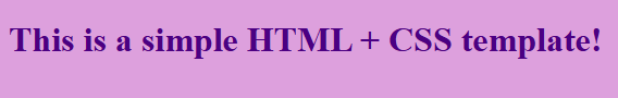
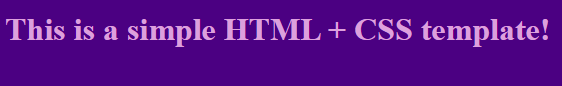
body {
  background-color: plum;
  color: indigo;
}

@media (prefers-color-scheme: dark) {
  body {
    background-color: indigo;
    color: plum;
  }
}
In some cases, you may want to adjust the colors according to branding or taste. You can do this with the CSS media query prefers-color-scheme:
However, one of the latest features also offers you the option of achieving the effect without media queries.
:root {
  --light: plum;
  --dark: indigo;

  color-scheme: light dark;
}

input {
  --accent-color: light-dark(var(--dark), var(--light));
  accent-color: var(--accent-color);
}
If the operating system or browser is in light mode, it uses the first value, and if it is in dark mode, it uses the second. As a result, the website automatically adapts to the user's operating system or browser settings, ensuring a seamless user experience.
How to Test prefers-color-scheme
To ensure that your dark and light mode implementation works correctly, you can use Chrome DevTools to simulate user preferences:
- Open Chrome DevTools (
F12orCtrl+Shift+Ion Windows/Linux,Cmd+Opt+Ion macOS). - Go to the Rendering tab. If it’s not visible, open the Command Menu (
Ctrl+Shift+PorCmd+Shift+P), search for Rendering, and select Show Rendering. - Scroll down to the Emulate CSS media feature prefers-color-scheme section.
- Select Dark to enforce dark mode or Light to switch back.

This allows you to preview how your website looks and behaves under different user settings without changing your system preferences.
Designing and Developing a Website Without a Toggle
If a website relies solely on prefers-color-scheme and does not provide a manual toggle, careful consideration must be given to ensure usability:
- Ensure Good Contrast: Dark mode should not rely on pure black (
#000000) and pure white (#FFFFFF); instead, use softer shades like#121212and#F5F5F5for better readability. - Test Across Devices: Some users may have system-level settings that do not match their actual preference. Testing ensures the design works well in both modes. Use Enable automatic dark mode in DevTools like Chrome to preview and debug dark mode behavior.
- Avoid Color Conflicts: Certain brand colors may not work well in dark mode. Ensure all elements remain legible.
- Use Adaptive Images: Some images may appear harsh in dark mode. Consider using
filter: invert(1)or providing alternate images for different modes.
Conclusion
Dark and light modes enhance user experience, accessibility, and energy efficiency. While manual toggles are still commonly used, modern CSS and system-level settings allow for automatic adaptation. Whether or not you include a toggle switch, careful design considerations ensure that your site remains accessible and visually appealing in both modes.
This post was originally published on Fronta11y for GAAD (Global Accessibility Awareness Day) 2025, in German.